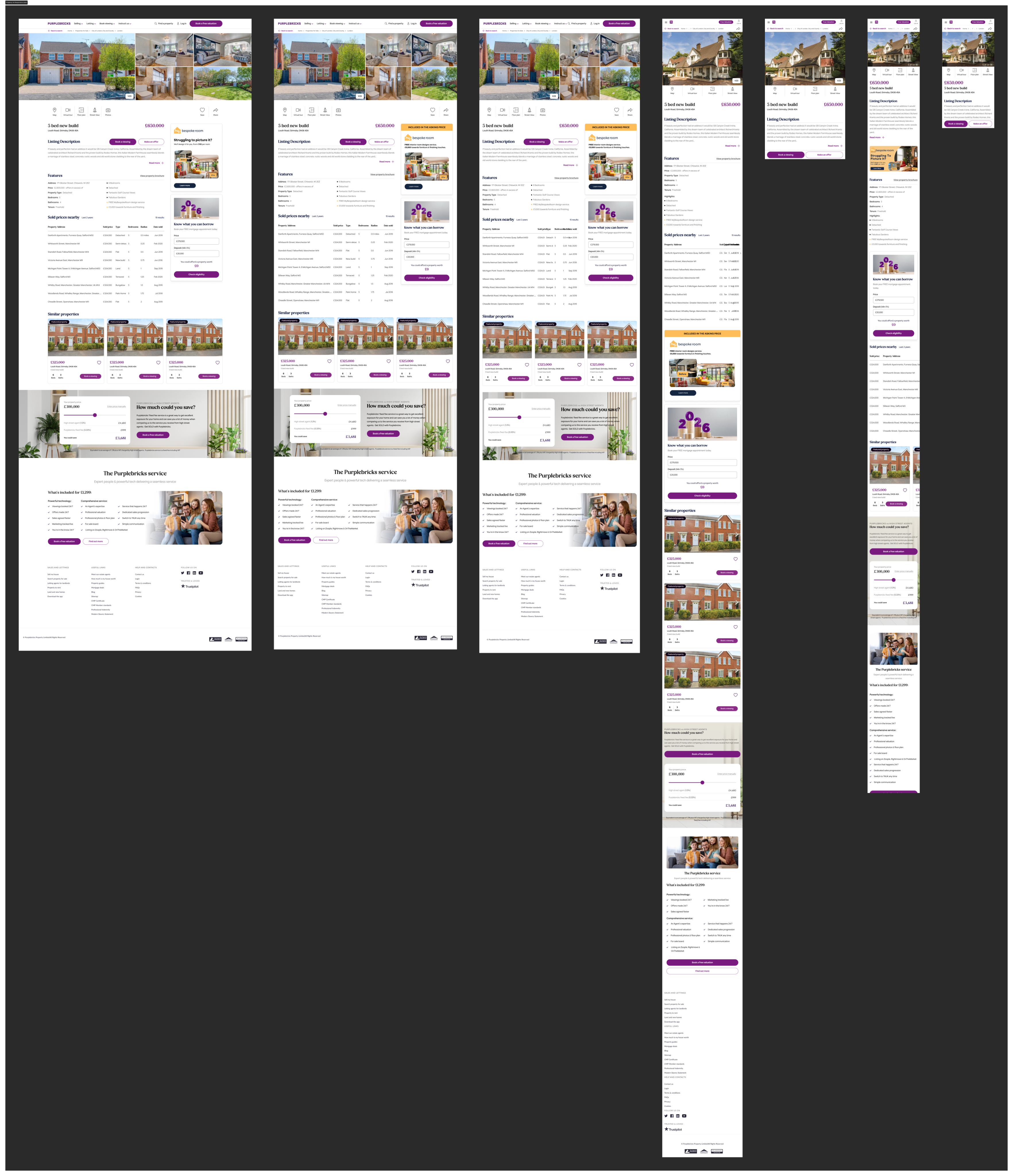
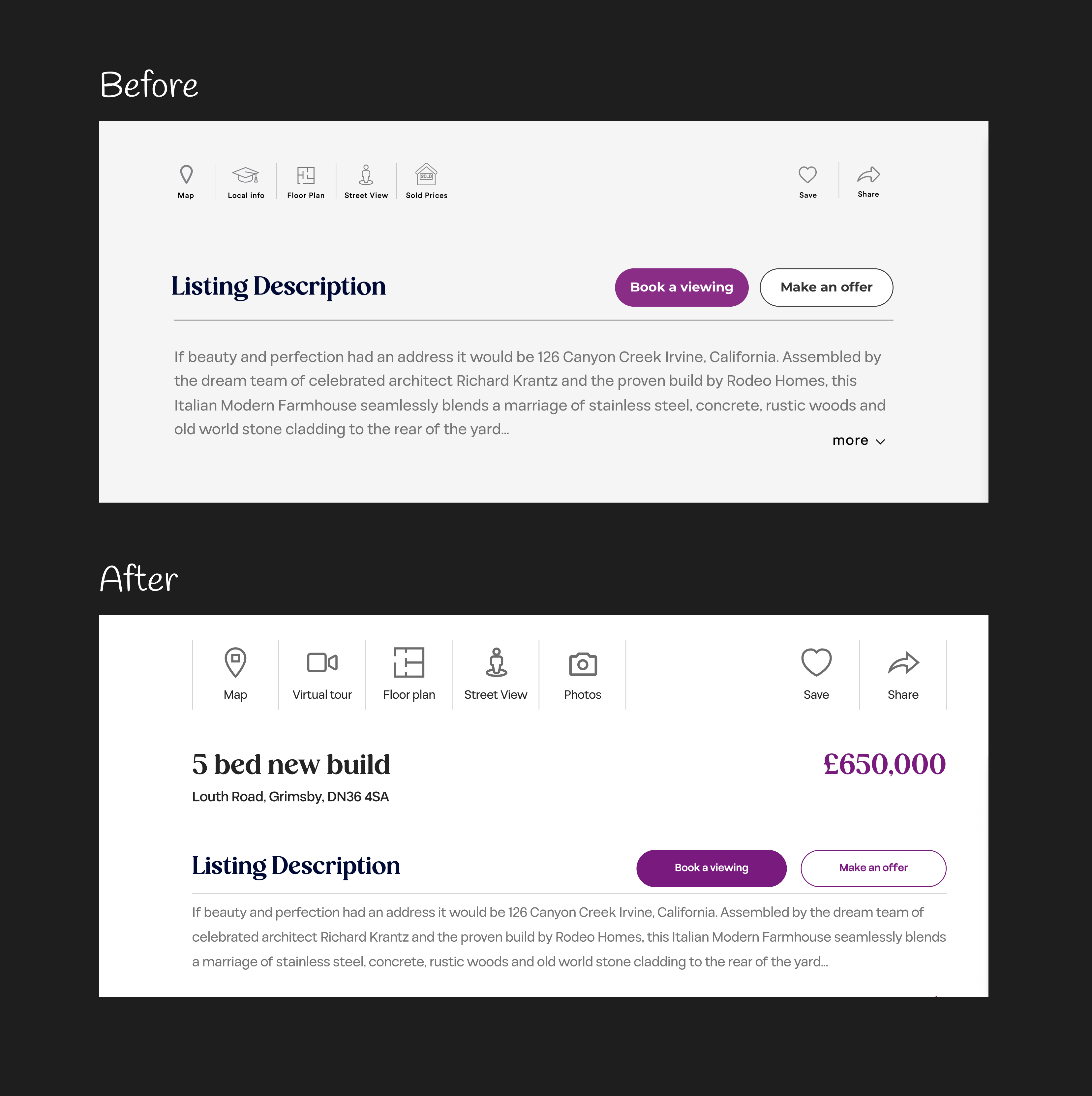
1. I restructured the information hierarchy by elevating the title, address, and price to the top of the page, reducing time to key decision-making content.


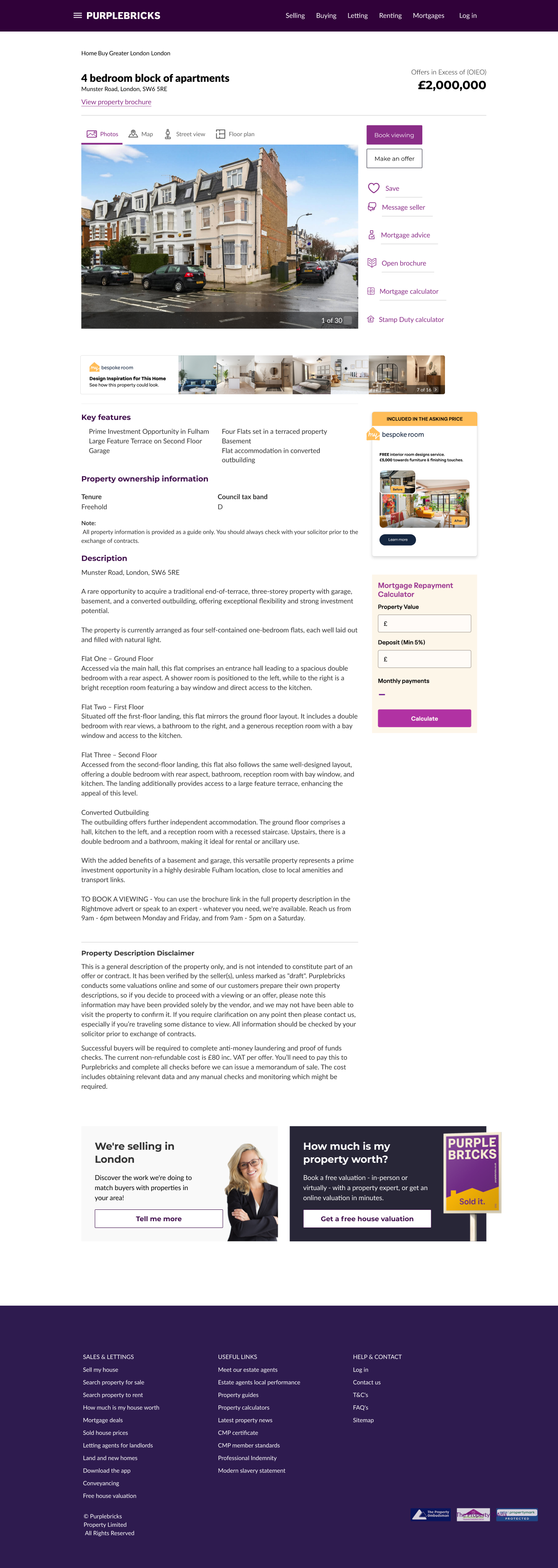
The Purplebricks search and listings experience was designed in 2014. It hadn’t been touched since.
Twelve years later, it was still one of the highest-traffic areas of the product. The challenge wasn’t just to make it look cleaner. We wanted to help people find the right property faster, while stripping back the brand and putting the focus where it belonged: on the customer.
At the start of the project, the pages attracted around 160,000 monthly visitors. After the redesign, that grew to an average of 171,000.
Here’s how we got there.
The CEO started the project by creating his own design to map out his vision for the new experience.
That created an interesting challenge.
The existing product had been shaped directly by him, so introducing a more considered design approach meant I couldn’t simply come in and say, “this needs to change.” I needed to understand the thinking behind the design, then use design principles, consistency and customer needs to show where we could make it stronger.
A few of the biggest changes came from questioning some of the assumptions baked into the old experience.
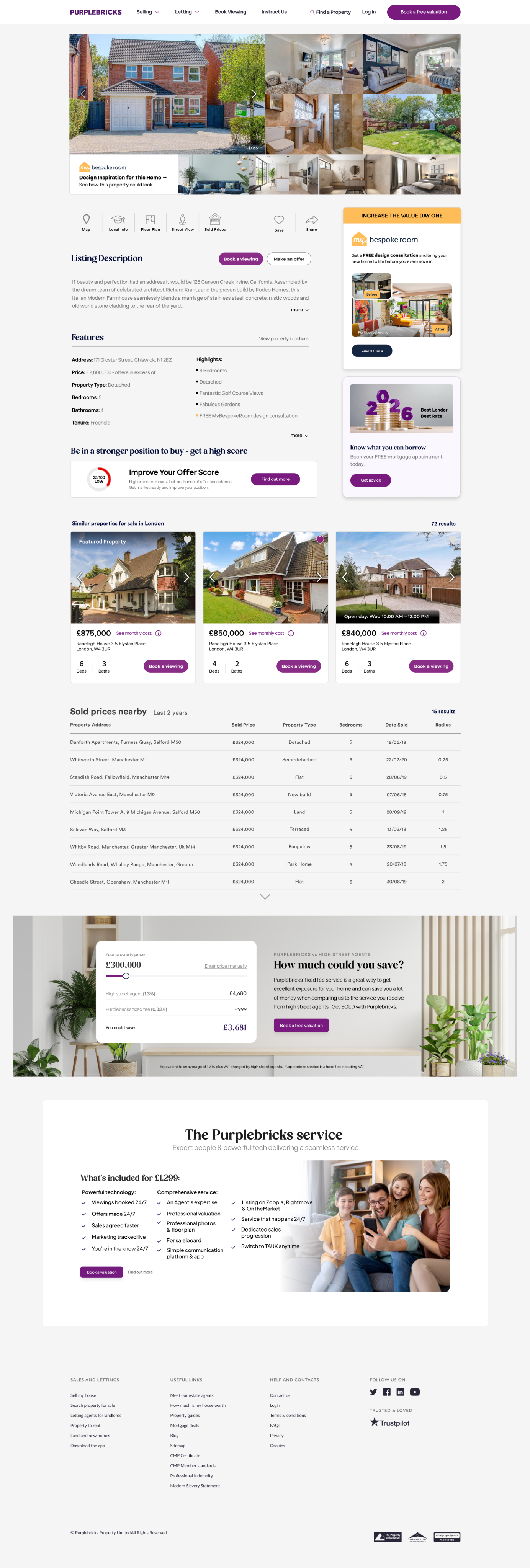
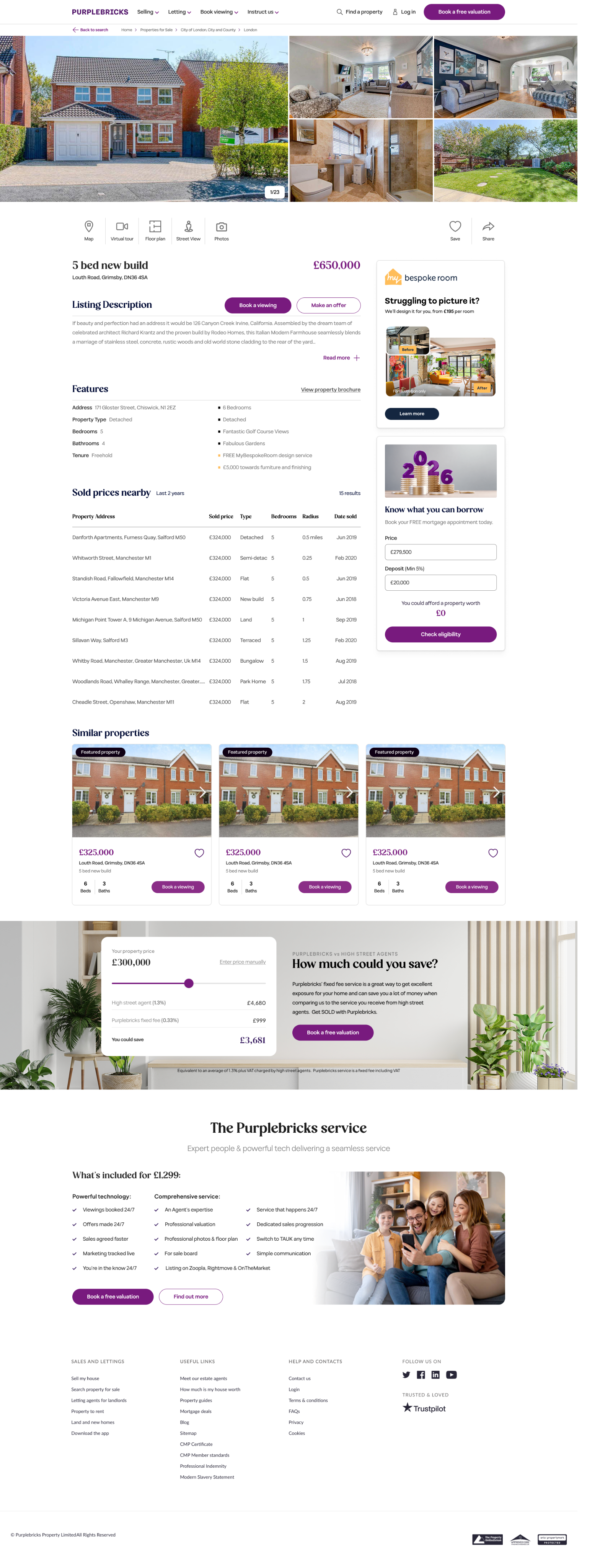
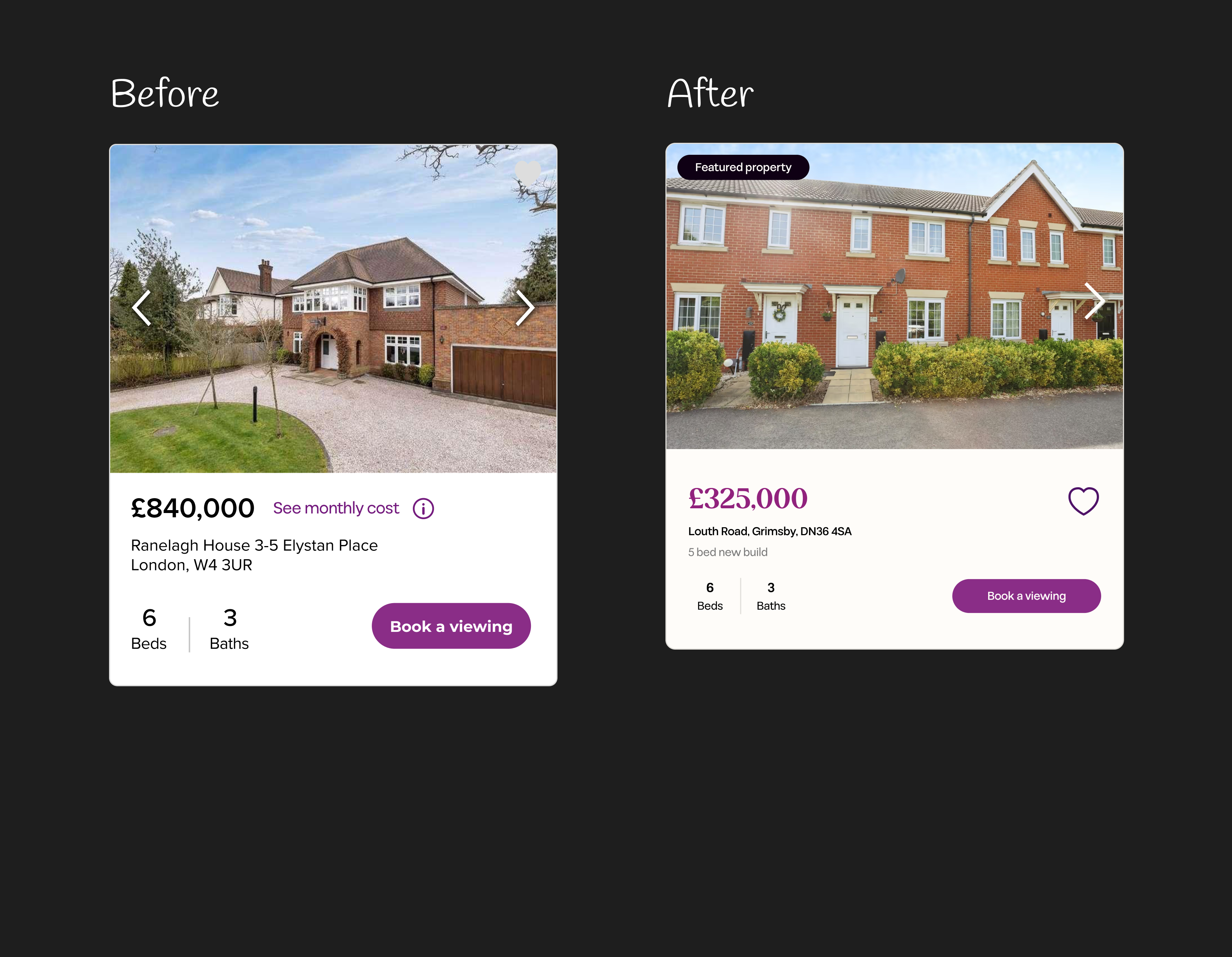
1. I restructured the information hierarchy by elevating the title, address, and price to the top of the page, reducing time to key decision-making content.
2. I gave photography much more space with a large image banner and introduced a pop-out gallery so users could explore the property without losing their place.
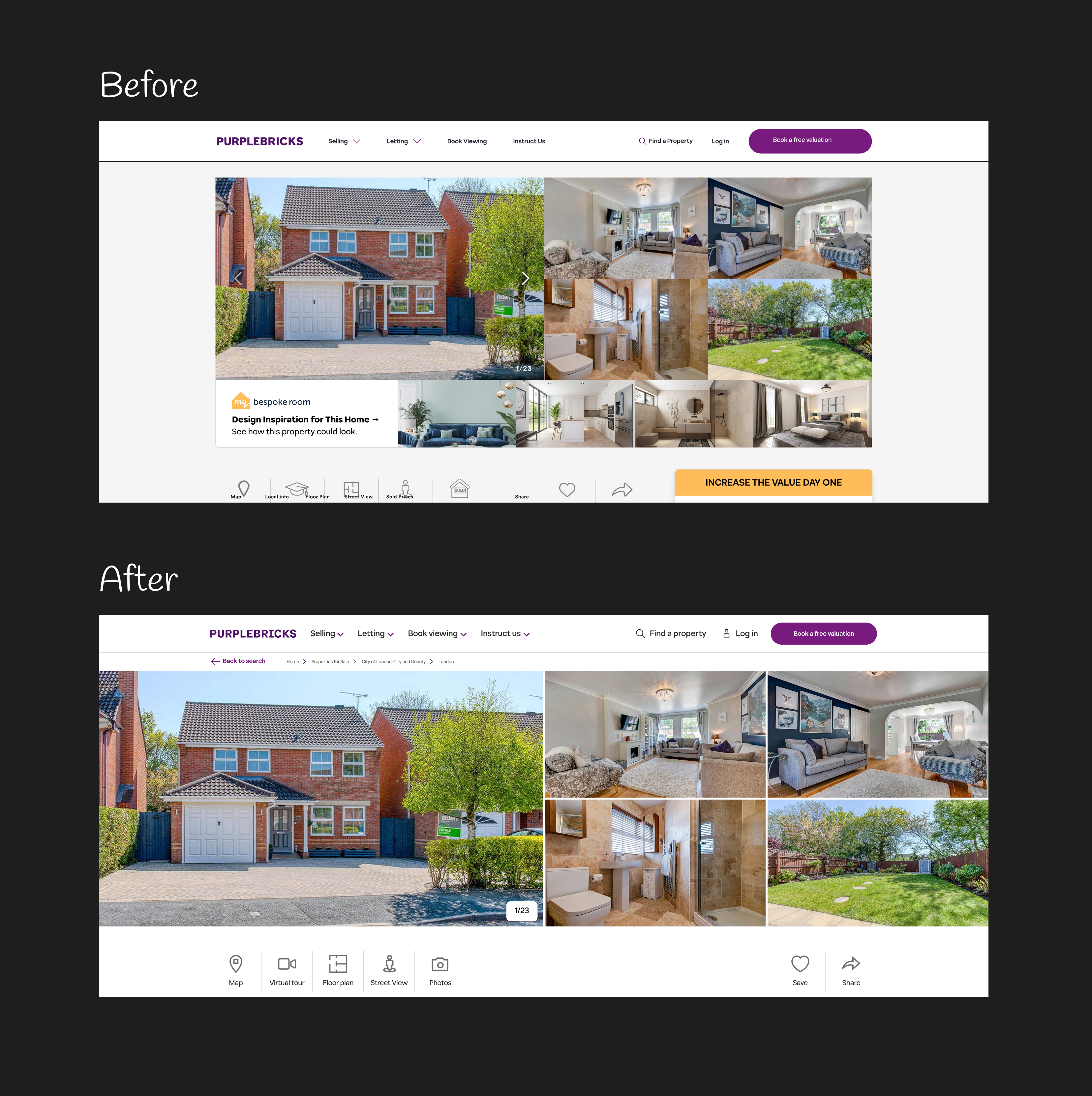
3. I standardized the icon set to a uniform bounding box and rebuilt each with consistent stroke weights, creating a cleaner and more cohesive visual system.
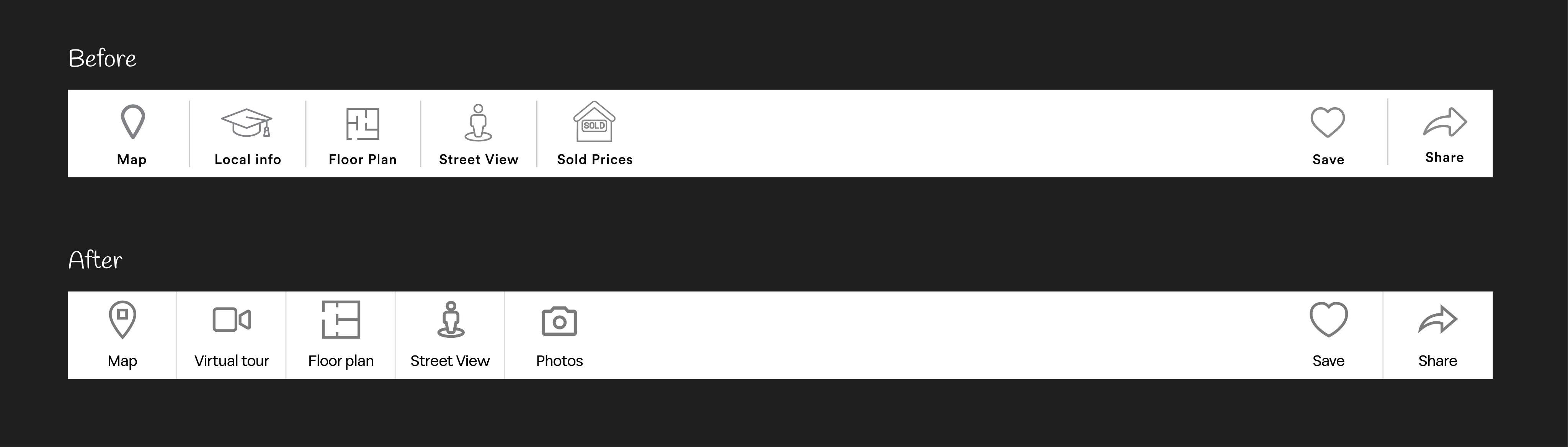
4. I embedded the mortgage calculator directly within the listing experience, eliminating a disruptive page redirect and keeping users engaged in their decision-making flow.
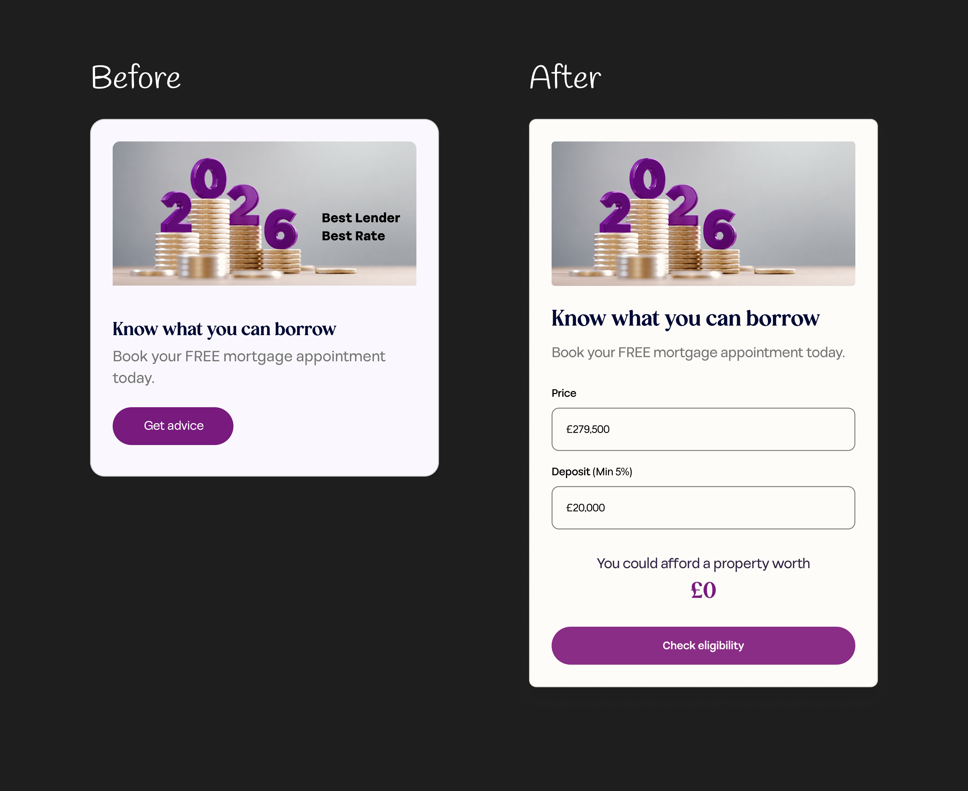
5. I applied the brand typeface to the price to strengthen visual distinction and refined the hierarchy across address, beds, and baths to improve scannability.
While all of this was happening, we were also introducing a new design system.
This created another challenge: the CEO had been burned by previous design systems that felt restrictive and slowed the team down.
So I didn't want to sell him a library of components: I wanted to sell him a better way of building.
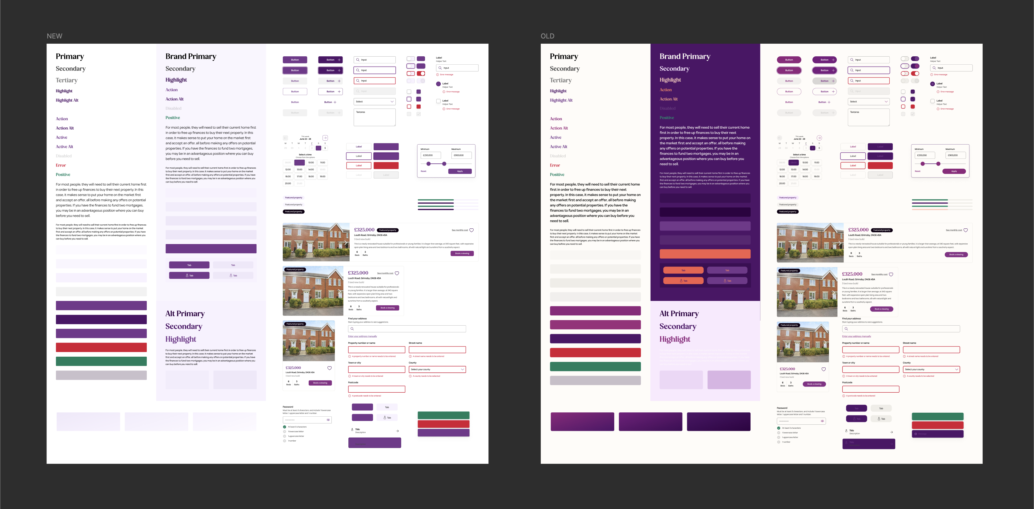
In our alignment session, I framed the design system as a set of Lego bricks for his vision. Instead of repeatedly recreating his ideas from scratch, we could document them as flexible components that the whole team could use.
That meant:
For a team of three designers, that gave us a much stronger foundation to scale the design function and increase delivery speed.
The result wasn't just a cleaner version of a 12-year-old website.
We created a stronger foundation for the product to evolve from, while making the experience clearer, more modern and more focused on the customer.
And the impact was measurable. 160,000 → 171,000 monthly visitors. That's a 7% increase in average monthly traffic after the redesign.
But the biggest win was the shift in thinking. Across my team, our design function and most importantly leadership, we stopped asking: “How do we make the website look better?” and started framing each new feature as way to scale our business and improve team dynamics while building a product that people want to use, return to and ultimately trust when they're looking for their next home.
Check it out here: purplebricks.co.uk/search/property-for-sale